
Introduction
This is the final installment of the preferred note REPE case study. You should begin at part one, otherwise this section won’t make much sense. But if you’re joining us from part five, we’re going to improve the sensitivity table that we ended with.
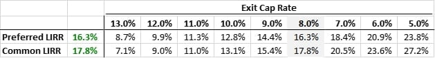
This sensitivity table looks great, but let’s expand it. I’m not going to show it here, but you should recreate the same sensitivity shown above but ranging from an exit cap rate of 20.0% to 5.0% in half-step intervals. This big sensitivity table will generate the backup data for the chart we are going to build below. We aren’t going to read it as a table such as the one above since it will be too large to fit in a slide deck. Charts are an excellent tool for analysts to quickly convey real estate LBO models to their managers.
Charting the Sensitivity
The chart below plots our levered return (y-axis) against the exit cap rate (x-axis). Although members can download the full source backup real estate LBO model at the link below, you should be able to build this yourself pretty easily. The data for this chart was generated by two one-way sensitivity tables as described immediately above. I built one for the preferred and another for the common. Also, I’ve sorted the exit cap rate values in descending order so the chart reads more intuitively. As the exit cap rate decreases, returns go up. If you aren’t familiar with this inverse relationship, I strongly recommend you first study the REPE Starter Kit.
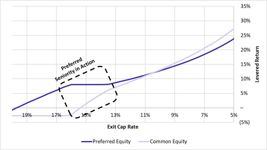
Are you having an aha moment?
The above chart beautifully explains this entire preferred note case study in one image. Looking at this gorgeous data, let’s cover the highlights:
- What is the value of the flat piece in the preferred equity returns line? Without even building a model, you should be able to tell me what the Y value is for that flat segment and why you know it to be true. If you guessed 8.0%, I’ve taught you well. That is your 8.0% Cash and/or PIK preferred coupon in action, exactly as described in the original prompt.
- But why is that region flat? This is the section where the investment returns only enough to pay the 8.0% preferred coupon, but nothing else. In this flat region, you can see how the preferred gradually drains the common equity return until it cannot go any lower. Once the common flat lines, you notice the preferred starts dropping.
- Now do you understand seniority? In exchange for downside protection, the preferred equity forgoes some of its upside. But not all of it. They still receive some upside gains, just not as much as the common. This is exactly how the preferred investors pay for their seniority in the downside scenario. And you could imagine why it might be worth it, especially if you’re an investor such as a pension fund who must cover annual obligations.
Conclusion
Hopefully things are starting to come together. In real estate private equity, everything is a trade. If you aren’t exchanging literal dollars, you might be negotiating the specifics of your subordination to a preferred or mezzanine investor. Building models and sensitivity tables is a fundamental skill that allows you to understand exactly what you’re negotiating. You should see how this curve evolves as you play with various inputs such as NOI growth, exit cap rates, and the structure of the preferred coupon and exit participation.
Anyhow, I’ll leave you with this. Go back to the original prompt and try to finish this case study from scratch in one sitting. Don’t cheat, act like you’re in-person at a final round interview. Put on a suit if you must! You have to practice this REPE case study to learn it. Best of luck!